

27
Total Feedback
May 28
Last Updated
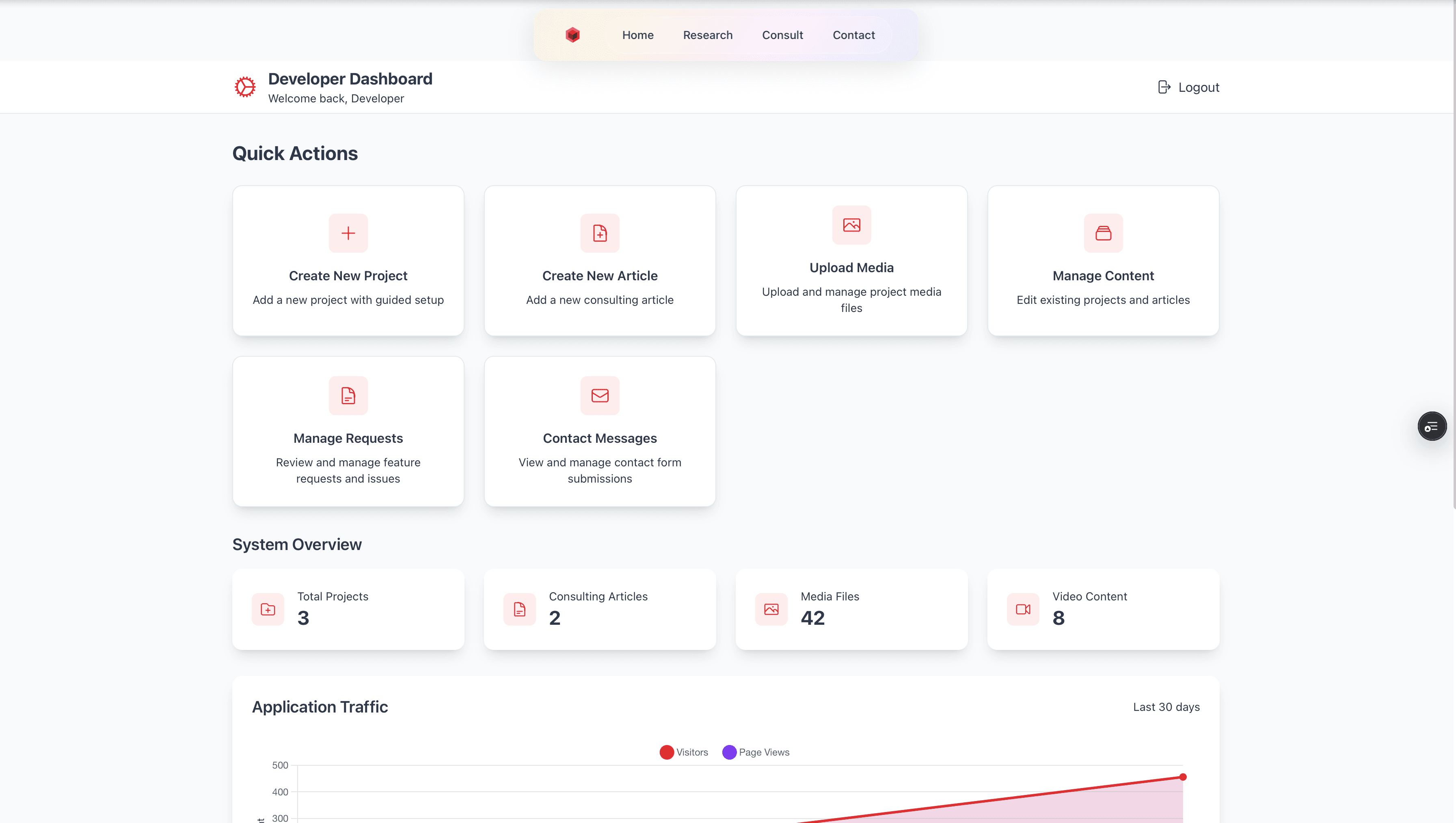
Key Features
Framer MotionReact HookHeroiconsEsLint+4 more
Tech Stack
Next.jsReactTypeScriptTailwind+2 more
Image Gallery
Updated Admin
AI Prompt - GitHub 2
AI Prompt - GitHub
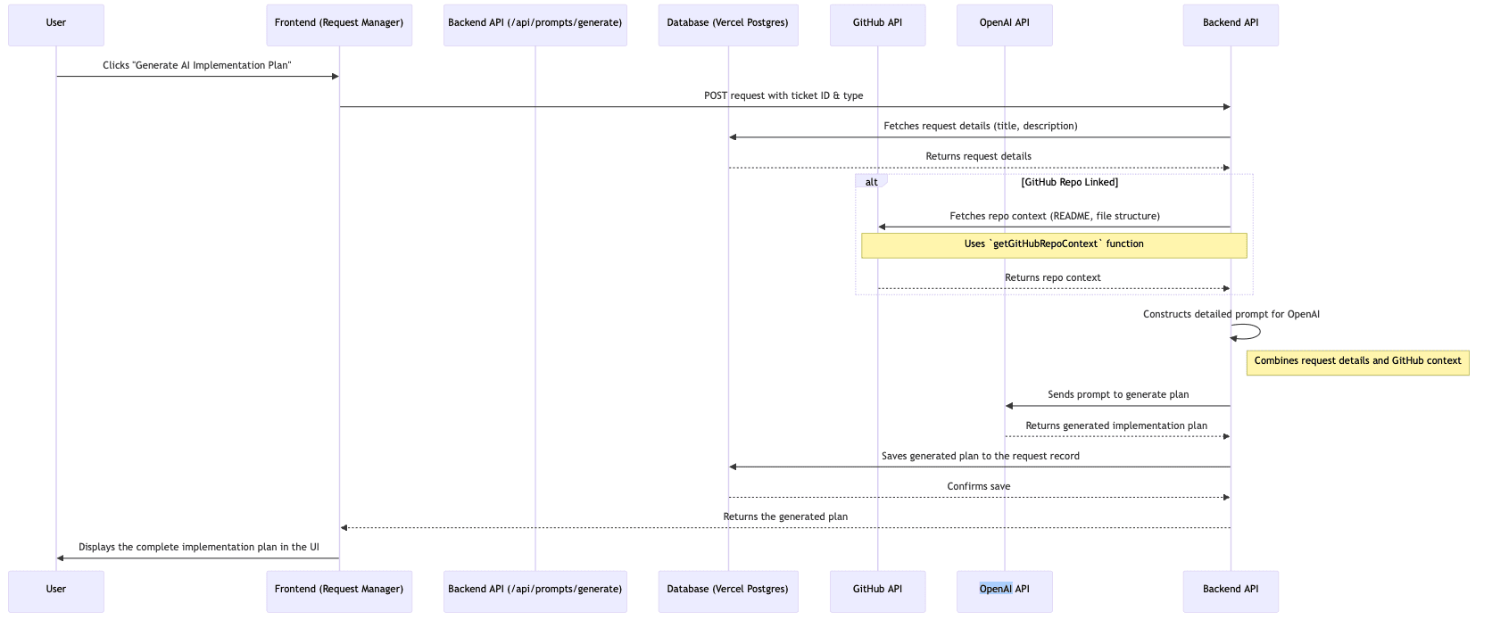
AI Prompt Sequence Diagram
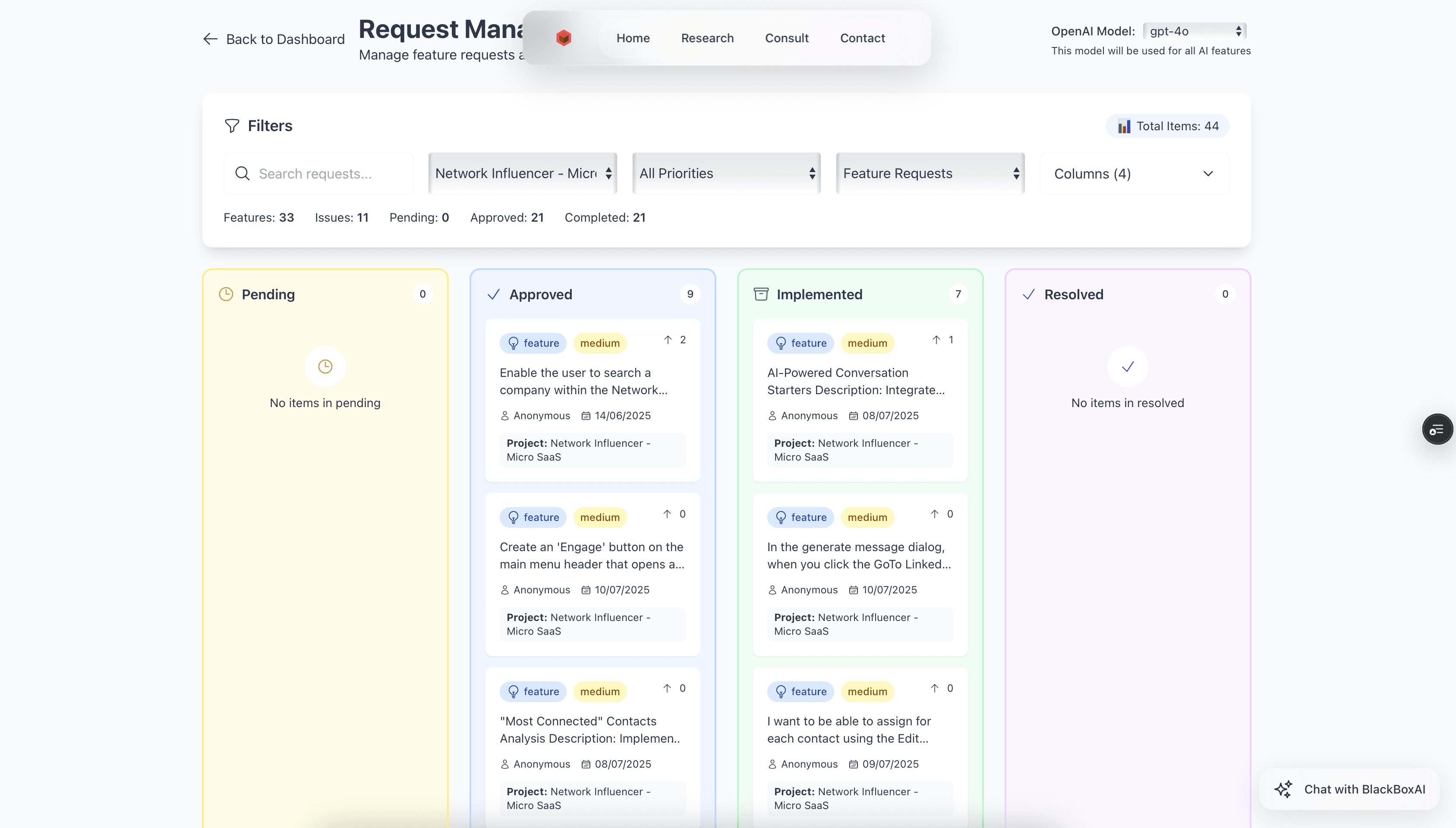
Kanban Board
Project Timeline
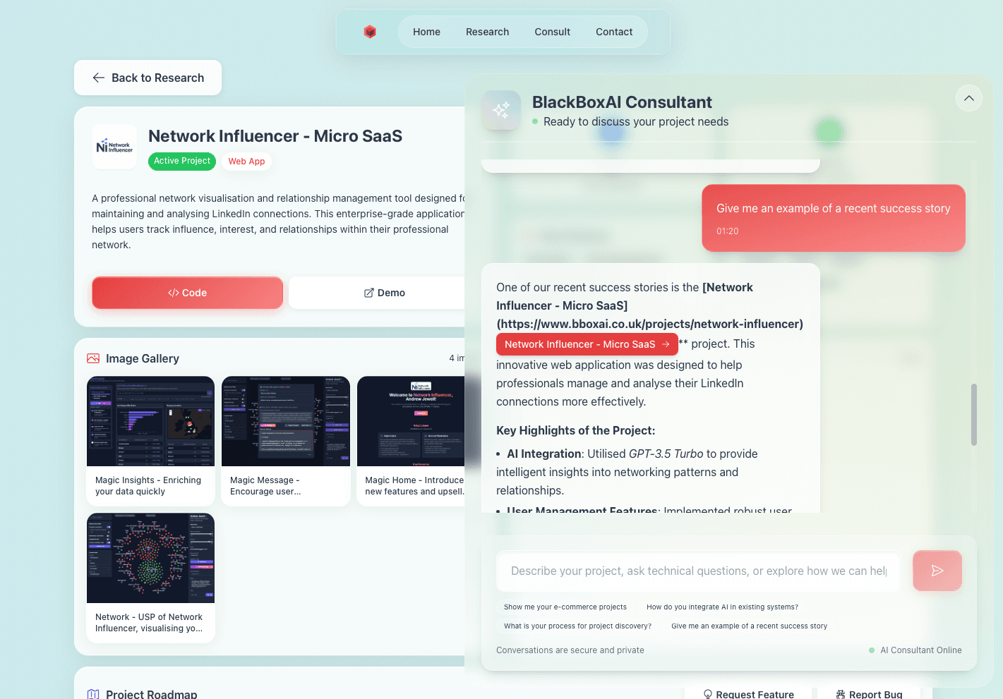
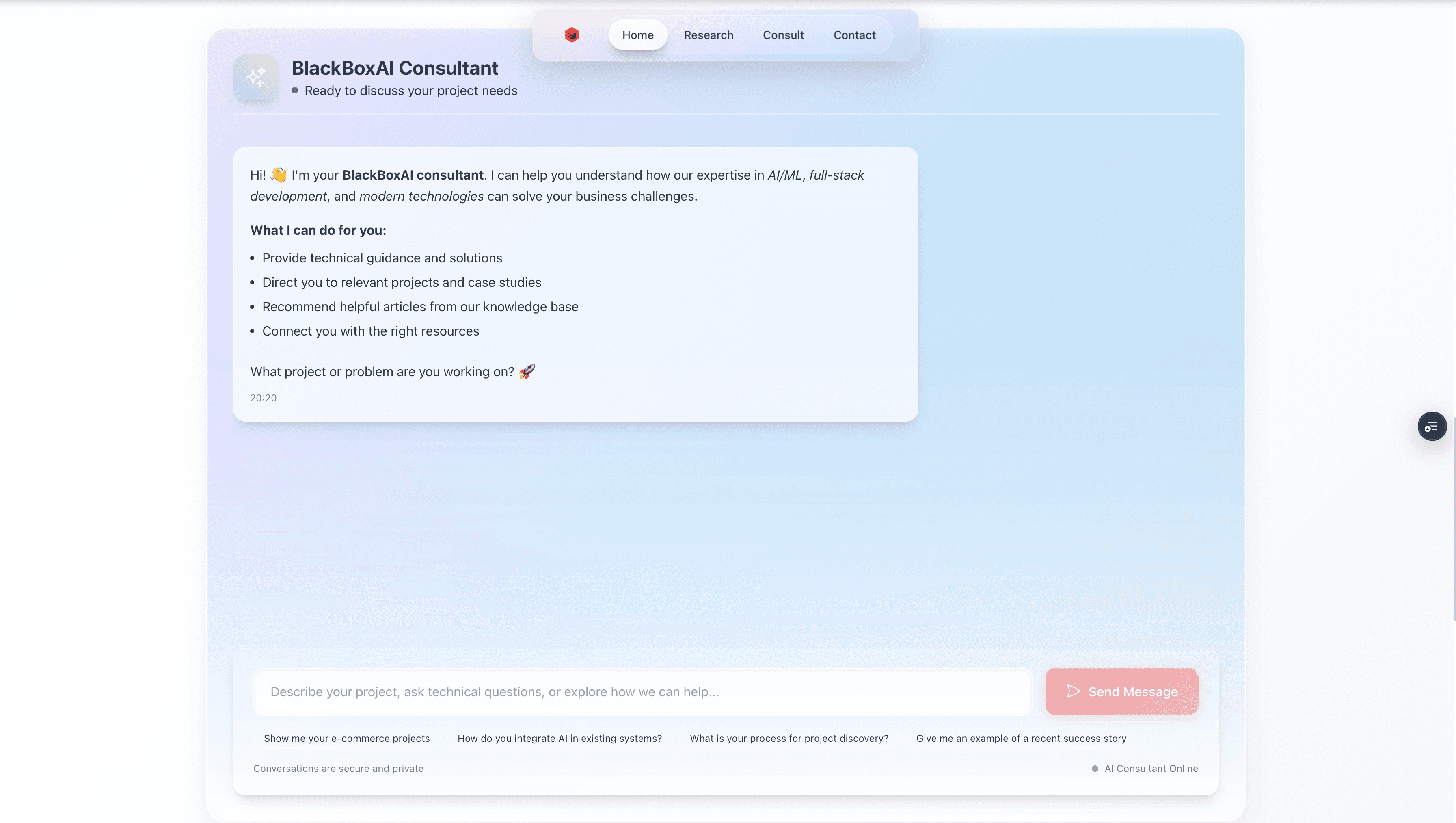
Consultant ChatBot
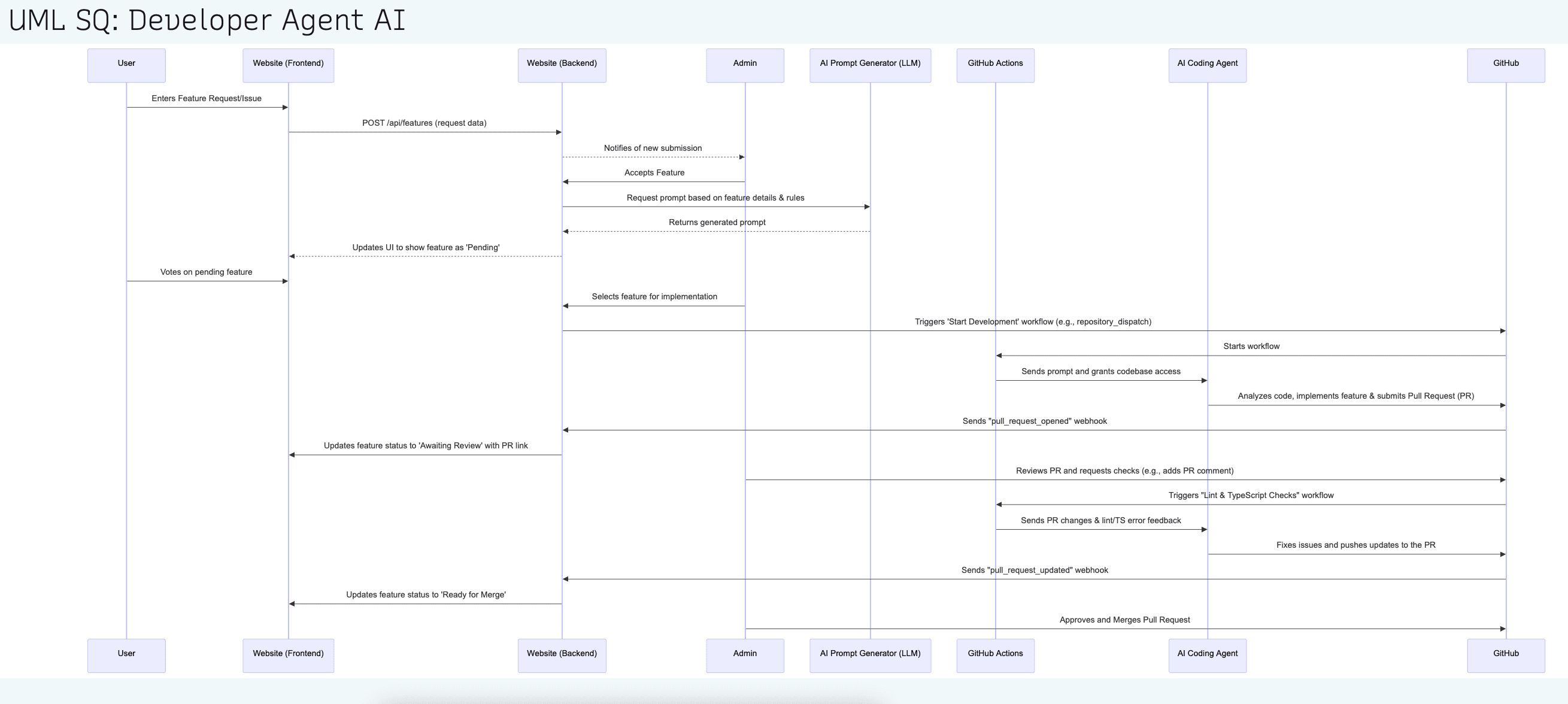
UML Sequence Diagram: Agentic Coding Flow
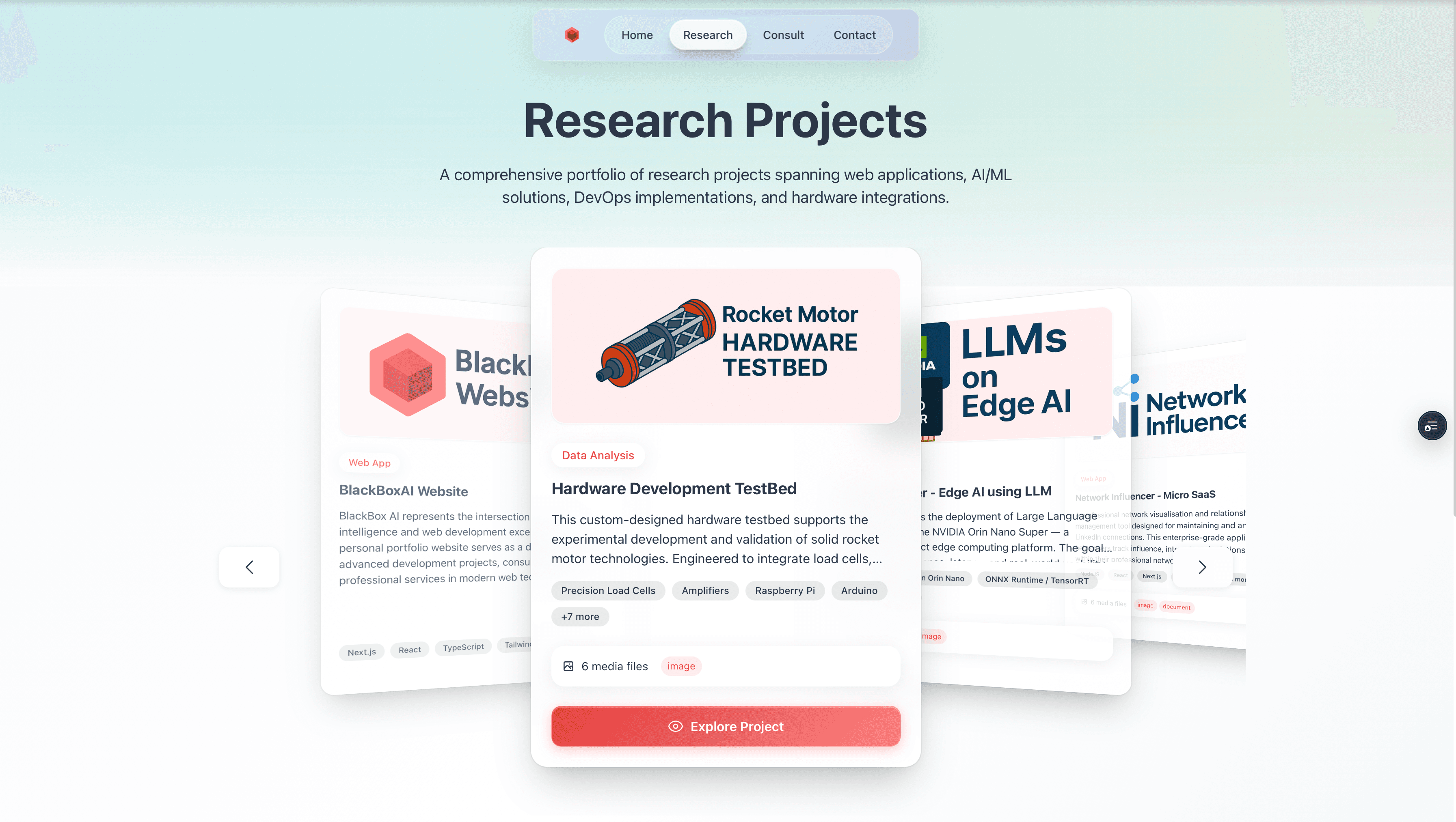
Project Page

Consult Page
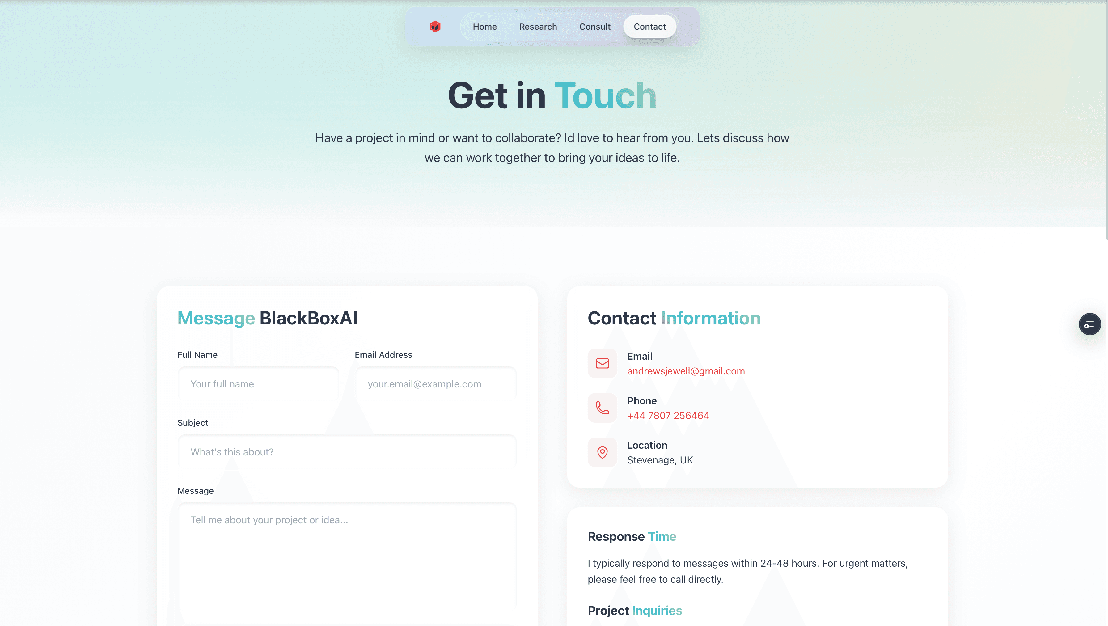
Contact Page
Home Page - ChatBot
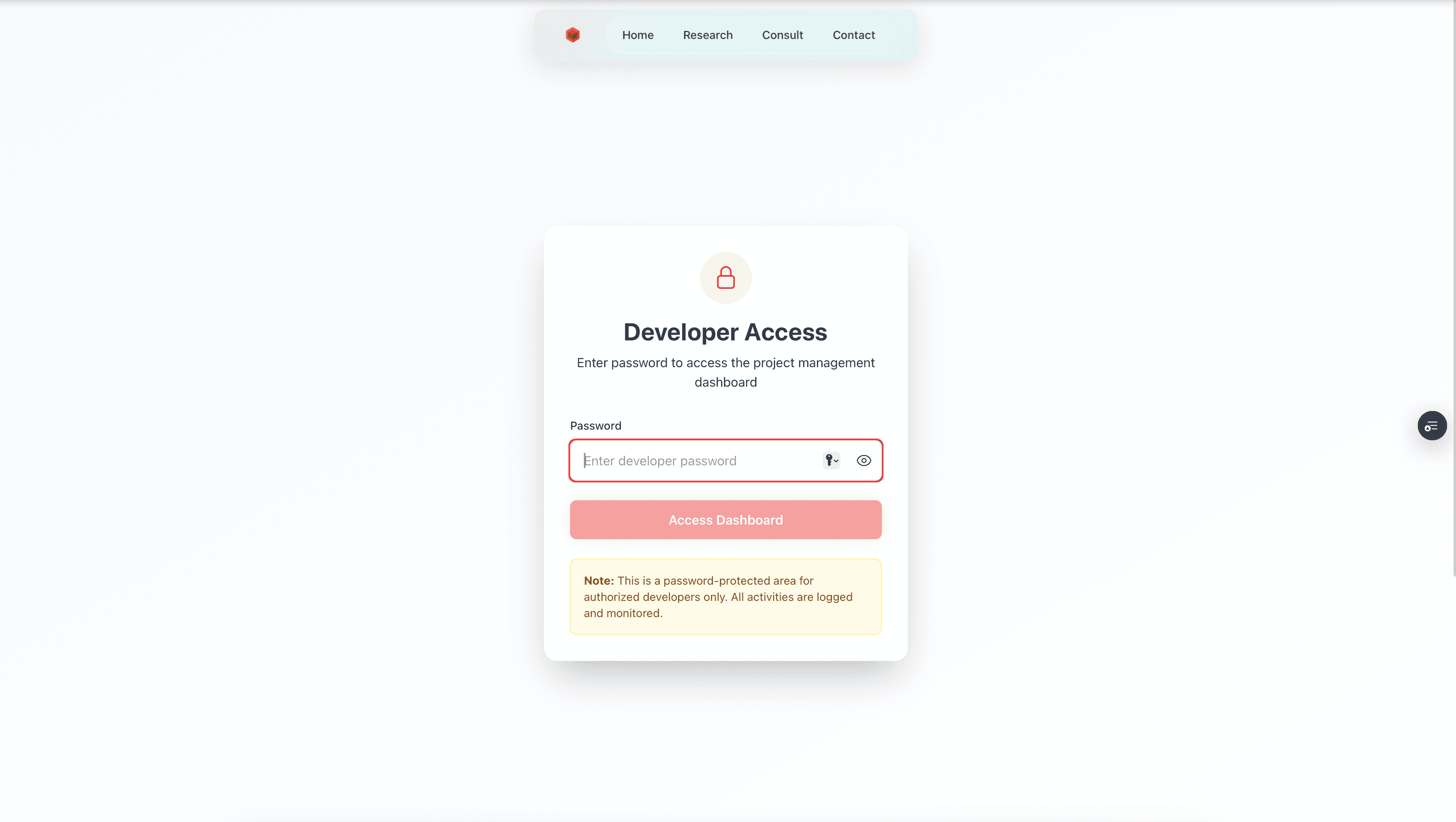
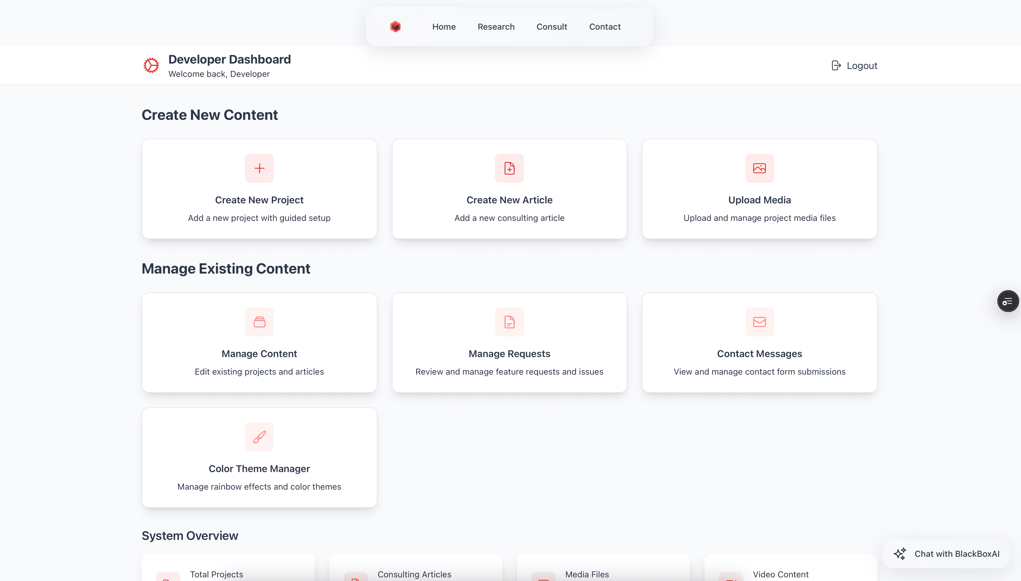
Developer Page - Login
Developer Page - Menu
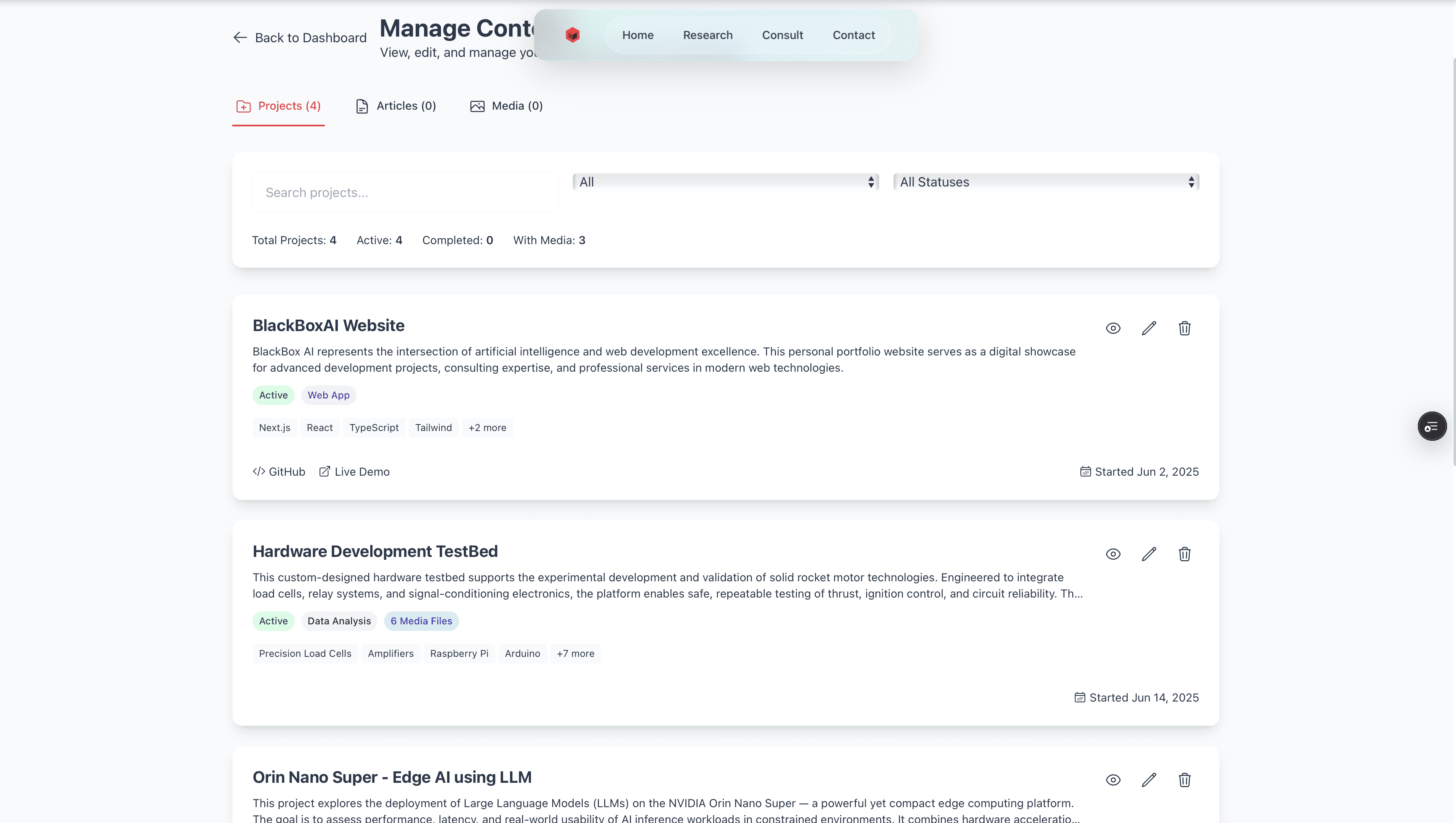
Developer Page - Project & Article Manager
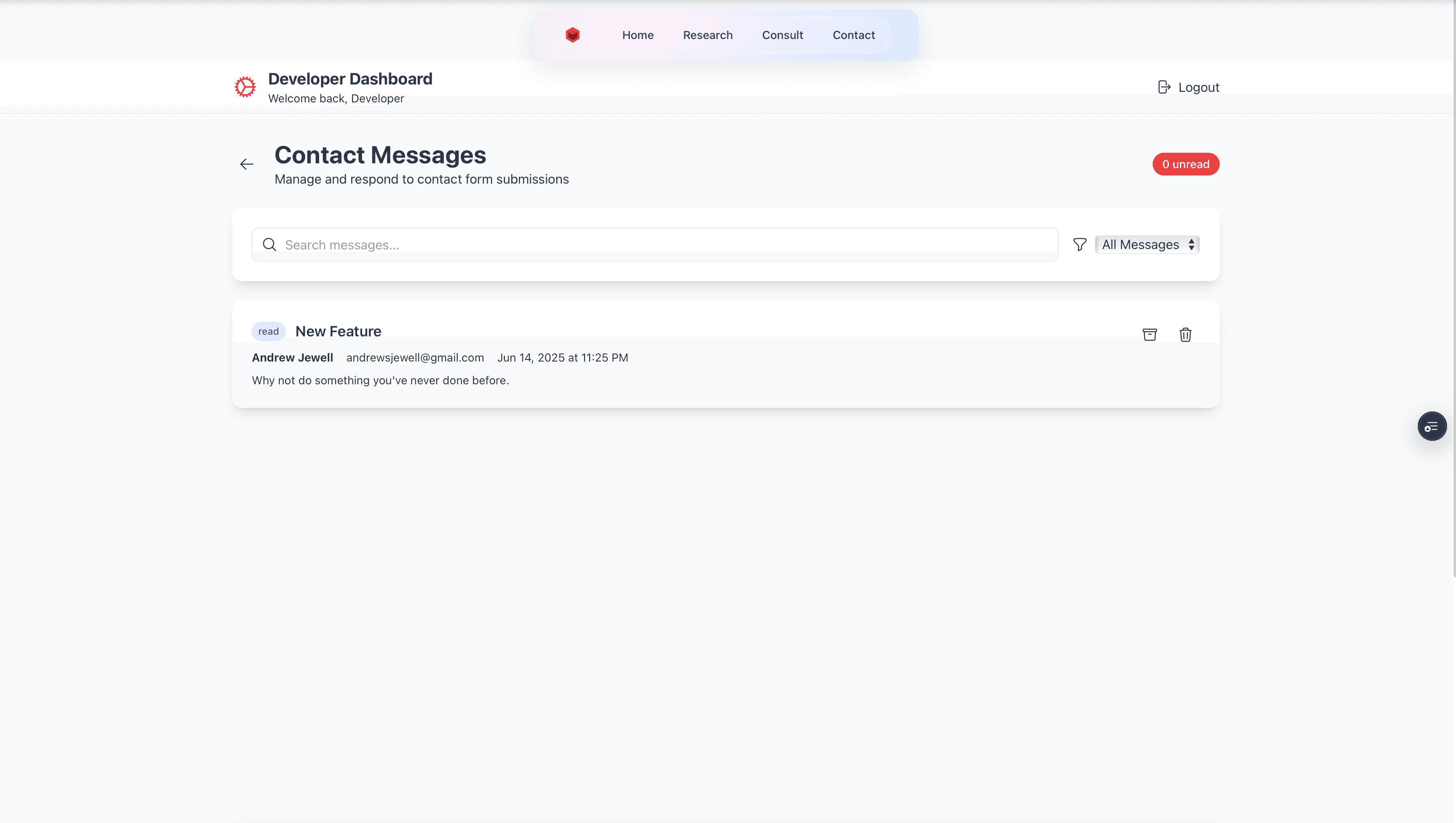
Developer Page - Message Manager
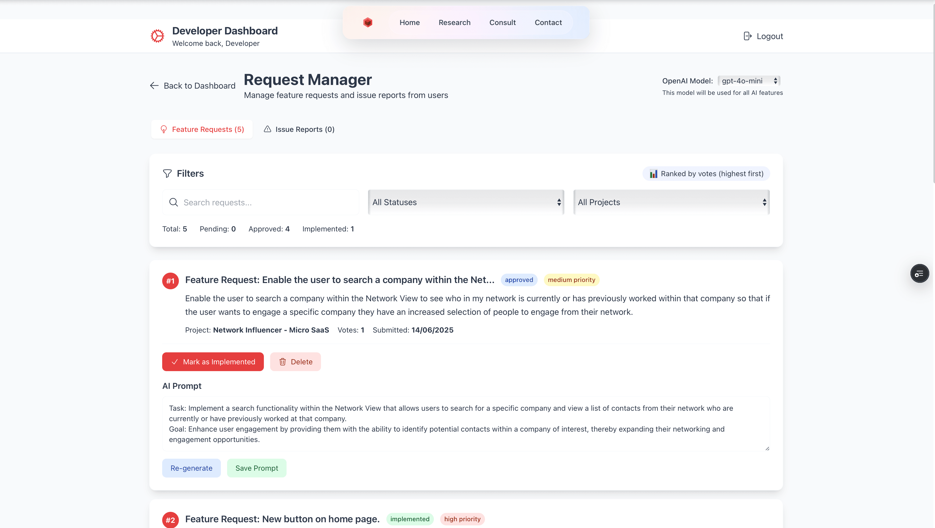
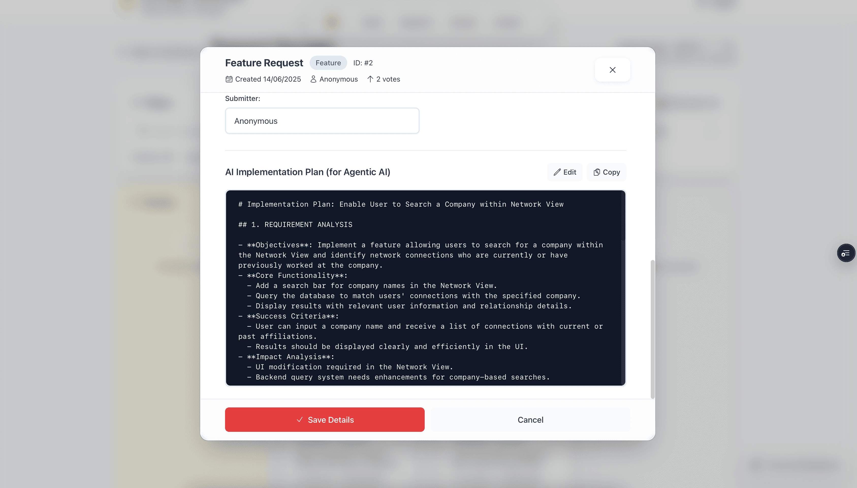
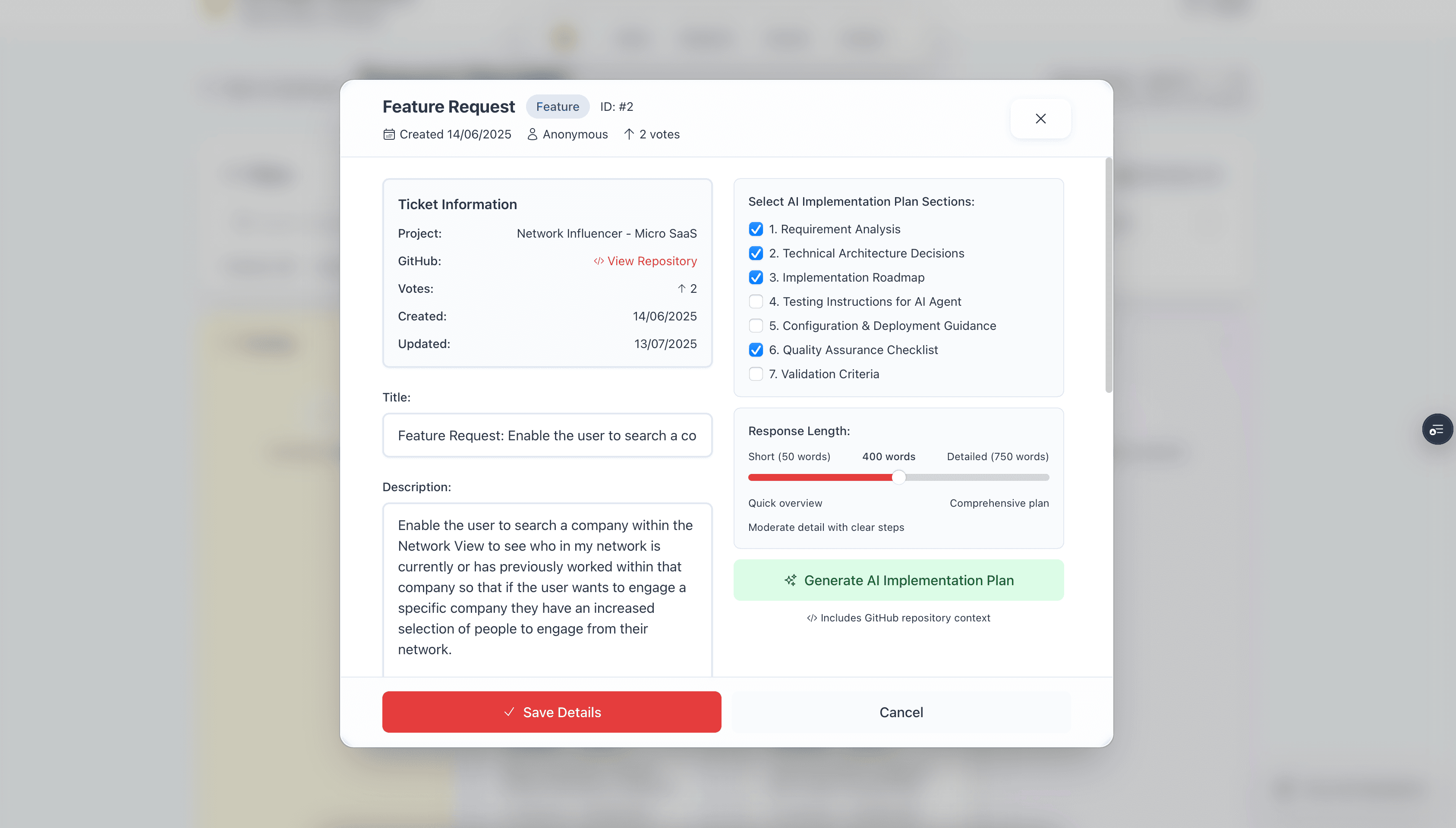
Developer Page - Request Manager
Loading updates...
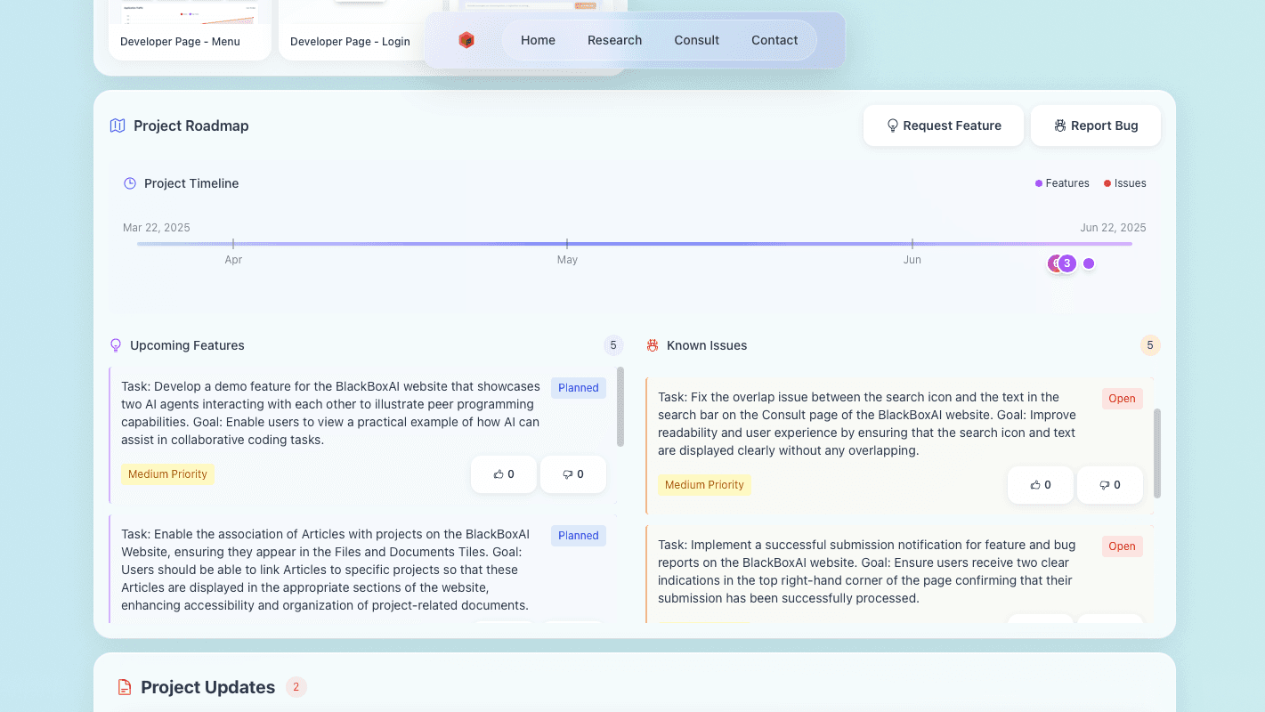
Project Roadmap
Loading timeline...
Upcoming Features
Enable me to re-order Services and Projects on the carosel view on the main page. The user should be able to modify this order from the Admin pagePlanned
Medium Priority
Add an AI Use Case Section to each Project to be shown on the main page Project card to illustrate what the project was learning.Planned
Medium Priority
BlackBoxAI article of the day in the consult section.Completed
High Priority
As a user, I want to be able to view an interactive timeline of research project milestones on the home page under the "Research Projects" section. This will affect the home page, enhancing my ability to track project progress with detailed milestone information.Completed
High Priority
As a user, I want to be able to seamlessly integrate Cursor and IDEs with the BlackBoxAI website for improved functionality. This will affect the server-side architecture of the BlackBoxAI website.Completed
Medium Priority
Known Issues
Double bug and feature submission indications is back - remove.Open
Medium Priority
Project Challenges
🎨 UI & Design Consistency… the Long Road
Design is never “done” — and in this case, the visual direction evolved a lot over time.
• Multiple redesigns: The BusinessAgentChat component went through several complete visual transformations — from glassmorphism to modern gradients to rainbow-tinted styling.
• Formatting headaches: Apostrophes and HTML entities became a surprisingly persistent issue, requiring multiple passes to fix across the app.
• Layout overhauls: I ended up refactoring component layouts more times than I’d care to count to strike the right balance between aesthetics and usability.
🌍 Internationalisation & Language Nuance
Making things readable, localised and correctly styled in UK English took more effort than expected — especially when retrofitting a codebase.
• American → British English: I had to systematically update dozens of files to follow consistent UK spelling throughout.
• Encoding gremlins: HTML entities (especially for apostrophes) caused frustrating rendering issues across multiple components.
• Component-wide consistency: Some strings were buried deep in rarely touched files, so ensuring spelling and tone consistency was a full sweep exercise.
🔐 Type Safety & Data Handling
As with many TypeScript-heavy projects, strong typing was powerful but occasionally painful.
• Evolving types: Initial interfaces weren’t robust enough, leading to multiple rounds of type refactoring and stricter definitions.
• API parameter friction: Several bugs came down to inconsistent parameter handling between API routes and the database layer.
• Async chaos: I had to untangle async/await issues in API handlers, particularly with headers and request processing logic.
🖼️ Asset & Media Management Issues
Media handling always looks easy — until it isn’t.
• Path resolution bugs: I ran into trouble with image paths inside the MarkdownRenderer, especially when switching between relative and absolute links.
• Indexing errors: Modal media displays misbehaved due to incorrect index logic — tricky to debug, frustrating to fix.
• Improved context awareness: I ended up adding flags and association constraints to better handle how media was used across different parts of the app.
🛠️ Feature Development Complexity
Some of the more “invisible” features turned out to be the trickiest to implement.
• Analytics tracking: Integrating tracking and traffic analytics was more complex than expected, requiring precise event mapping.
• Dynamic content injection: Pulling dynamic website content into chat responses pushed the boundaries of the existing architecture.
• CRUD patterning: Features like contact forms, bug reports, and requests went through multiple iterations to get right — both in UX and backend structure.
⚙️ Performance & UX Hurdles
Keeping things fast and user-friendly demanded constant attention.
• Reload annoyances: At one point, I had unnecessary page reloads baked into the flow — removing them was a simple change, but made a huge difference to UX.
• Error state refinement: Error handling went through multiple rounds of tweaking to improve clarity and consistency.
• Component efficiency: Extracting and optimising components gradually improved performance, especially for repeat renders.
Project Solutions & Learnings
💡 Design System & Consistency
One of my early priorities was making the UI consistent and elegant without getting bogged down in perfectionism. Here’s what helped:
• Glassmorphism, standardised: I built reusable CSS classes for glass effects so they could be used across components with zero friction.
• Rainbow branding system: Applied a cohesive rainbow colour palette across the whole app – playful, recognisable and consistent.
• Iteration wins: The first version is never the final one. I let go of the pressure to “get it right first time” and embraced UI iteration as part of the process.
🌍 Robust Internationalisation
Supporting different languages and contexts properly turned out to be a bit more subtle than expected – particularly with JSX syntax and punctuation.
• Backticks + JSX: I used template literals to gracefully handle apostrophes and special characters.
• Text audit tools: Ran systematic find-and-replace sweeps to keep copy consistent and avoid “rogue strings”.
• Lint-friendly formatting: Found solutions that satisfied both ESLint rules and a good user experience – not always easy!
🔐 Type Safety First
TypeScript saved me from a dozen silent bugs. I leaned heavily into strong typing, and I’m glad I did.
• Interfaces everywhere: Defined clear interfaces for all major data structures.
• Typed DB operations: Improved type safety in all database queries and mutations.
• Unified error handling: Created standard patterns so errors are predictable and easier to debug.
🧩 Smarter Asset Management
Managing images, videos and other assets at scale needed more thought than I expected. A few small wins here made a big difference.
• Path logic: Wrote logic to intelligently resolve absolute and relative paths across environments.
• Context flags: Built in flags to manage how and where assets are used across the UI.
• Robust filtering: Developed reusable systems to filter and sort media by type and usage.
🚀 Feature Development: What Worked
Rather than jumping straight into UI work, I tried to build the scaffolding and API foundations first – and it paid off.
• API-first thinking: Wrote endpoints and business logic before touching the front end.
• Progressive enhancement: Added features in layers with appropriate fallbacks.
• User feedback loops: Made it easy for users to submit bugs and feature requests – some of the best improvements came directly from these.
⚡ Performance Learnings
Small architectural decisions early on had a big impact on performance and developer velocity later.
• Reusable components: Identifying common patterns early and extracting components saved me a lot of rewriting.
• Async done right: Clean async logic led to smoother performance and fewer edge-case bugs.
• Cache revalidation: Introduced smarter caching strategies to ensure fresh data without slowing things down.
🧠 Technical Learnings
• JSX + ESLint quirks: Getting JSX, ESLint rules and special characters to play nicely was surprisingly non-trivial.
• Next.js backend nuance: Understanding how API routes, headers and server-side logic works in Next.js was crucial.
• Evolving database design: Allowing the schema to grow organically with features made the system more resilient.
🔁 Process Improvements
• Small commits: Tiny, focused refactors made the codebase easier to maintain and much easier to review.
• User-first design: Letting real user feedback shape the UI led to cleaner, more useful designs.
• TypeScript early: Investing in types from day one was absolutely worth the effort later on.